Google Ad sense


All source codes in this blog are also available in Gregory Choi's Github Source code Repository


Wednesday, March 30, 2016

Getting financial statement in R (Income Statement, Balance Sheet)

One of my headache during my MBA course is to get financial statement from the internet. I am a fan of Yahoo Finance, but it was hassle to type all the income statements or the balance sheets to my excel.

Here's the simple tip to make you easier to do that with R.

First, you need to install Quantmod first. (If you haven't installed it)
> install.packages("quantmod")

It gets the data from google finance. As long as google finance lasts, you can get for free.

If I want to get the quarterly income statement of Facebook, here's the step.

> library("quantmod")
> getFinancials('FB')
[1] "FB.f"

meaning that the financial data have stored at the variable "FB.f" All we need to do is to request quarterly income statement.

> result <- viewFinancials(FB.f, c("IS"), c("Q"))
#IS means Income Statement, Q means Quarterly
#If you want to get annual data you can replace "Q" with "A"
Quarterly Income Statement for FB
> head(result)
                                       2015-12-31 2015-09-30 2015-06-30 2015-03-31 2014-12-31
Revenue                                      5841       4501       4042       3543       3851
Other Revenue, Total                           NA         NA         NA         NA         NA
Total Revenue                                5841       4501       4042       3543       3851
Cost of Revenue, Total                        824        720        668        654        653
Gross Profit                                 5017       3781       3374       2889       3198
Selling/General/Admin. Expenses, Total       1143        925        806        769        954

If you want to get quarterly balance sheet, you can use "BS" instead of "IS"

> balance_sheet_facebook <- viewFinancials(FB.f, c("BS"), c("Q"))
Quarterly Balance Sheet for FB
> head(balance_sheet_facebook)
                                 2015-12-31 2015-09-30 2015-06-30 2015-03-31 2014-12-31
Cash & Equivalents                       NA         NA         NA         NA         NA
Short Term Investments                16731      13147      11825       9769       9037
Cash and Short Term Investments       18434      15834      14125      12413      11199
Accounts Receivable - Trade, Net       2559       2010       1815       1508       1678
Receivables - Other                      NA         NA         NA         NA         NA
Total Receivables, Net                 2559       2010       1815       1508       1678

If you want to get total leverage ratio, you can just type 
> balance_sheet_facebook[27,1] / balance_sheet_facebook[17,1]
[1] 0.002307365

This is because 17th row and 1st column denotes the total asset in 2015-12-31 and
27th row and 1st column denotes the total liability in 2015-12-31

(You can just count the number from the first row)


Tuesday, March 29, 2016

Single regression with R to identify relationship between WTI and stock price of Exxon

[Previous lecture]
Getting stock volatility in R & Getting Histogram of returns

[Single Regression]
Single Regression is the most powerful tool to identify linear relationship between x and y, if we assume that there is a linear relationship between them. Basically, it is assumed that both have relationship like below.

y = ax + b

What we want to know is a and b. Then, we can predict y value with just x value. However, it doesn't explain which causes which. y could cause x or x could cause y. We don't know with single regression technique. Thus, this technique is not almighty. Please keep in mind that.

[The relationship between Exxon Mobile equity and WTI crude oil price]
Let's formulate a hypothesis first. In my mind, it is common sense that there is a positive linear (or log, square, whatever) relationship between WTI and Exxon Mobile equity value. As the oil price goes up, so does the profit of Exxon. We are going to validate our hypothesis through actual linear regression.
What we are going to do is
(1) Getting data from the internet
(2) Transform the data into the one that can be calculated
(3) Plot the scatter plot
(4) The single regression analysis
Let's take a look at the code.

[Code]
#Single Regression and Covariance
#Let's figure out the relationship between WTI and Stock price of exxon
#You can download the data from https://research.stlouisfed.org/fred2/series/DCOILWTICO/downloaddata
#I store the data in download folder you can change it.

library(tseries)
library(zoo) #Time series data type

xom <- get.hist.quote("XOM", #Tick mark
                       start="2015-01-01", #Start date YYYY-MM-DD
                       end="2015-12-31" #End date YYYY-MM-DD
)

#I am going to use close value only
xom_zoo <- xom$Close

#Plese download the file from stlouisfed
#Limit the range from 2015-01-01 to 2015-12-31 to compare it apple to apple
wti <- read.csv("/Users/seokbongchoi/Downloads/DCOILWTICO.csv")
#When it reads file first, it has categorical format we need to convert it.
wti$VALUE <- as.character(wti$VALUE)
#It also has garbage value "." in data. You can see in Excel. We can clean this with below command
wti <- wti[wti$VALUE!=".", #Get rid of any value that contains "."
           1:2 #I need first column, and second column as well.
           ]
#Finally I want to convert character to numeric value.
wti$VALUE <- as.numeric(wti$VALUE)
#We need to convert the data into the time series
wti_zoo <- read.zoo(wti, format="%Y-%m-%d")

#What we need is return.
xom_rate <- (xom_zoo - lag(xom_zoo))/xom_zoo
wti_rate <- (wti_zoo - lag(wti_zoo))/wti_zoo

regression_result <- lm(xom_rate~wti_rate)

plot(y=xom_rate,
     x=wti_rate,
     pch=19, #I want to use dot
     cex = .5, #The size of dot
     main="The regression between Exxon & WTI in 2015",
     ylab="Exxon return",
     xlab="WTI return"
     )
abline(regression_result, col="red") # regression line (y~x)

print(summary(regression_result))

[Output]
<Summary for regression>
Call:
lm(formula = xom_rate ~ wti_rate)

Residuals:
      Min        1Q    Median        3Q       Max
-0.059637 -0.006658  0.000426  0.006674  0.038156

Coefficients:
             Estimate Std. Error t value Pr(>|t|)  
(Intercept) 0.0003544  0.0007800   0.454     0.65  
wti_rate    0.2483610  0.0264306   9.397   <2e-16 ***
---
Signif. codes:  0 ‘***’ 0.001 ‘**’ 0.01 ‘*’ 0.05 ‘.’ 0.1 ‘ ’ 1

Residual standard error: 0.01235 on 249 degrees of freedom
Multiple R-squared:  0.2618, Adjusted R-squared:  0.2588
F-statistic:  88.3 on 1 and 249 DF,  p-value: < 2.2e-16

<Plot>


[Interpretation]
It is more important to know how to analyze the result of regression.

                    Estimate    Std. Error  t-value  Pr(>|t|)  
(Intercept) 0.0003544  0.0007800   0.454     0.65  
wti_rate    0.2483610  0.0264306   9.397   <2e-16 ***

So we found the value of a and b
a = 0.2483610
b = 0.0003544
So, our equation has a form like,
y = 0.2483610 x + 0.0003544
Thus, the return on oil price has a linear relationship with the stock value of Exxon.

It is noted that p value is less than 2*10^-16. The rule of thumb is that if it is less than 0.05, this regression analysis can be reliable. p-value for constant is not significant.
Adjusted R square is 0.2588. 25.88% of the variability in this graph can be explained by our model. About 75% variability cannot be explained by this model, meaning that there are more variables needed to fully account for the equity value of Exxon (You can name it. Leverage ratio, revenue, profit, ...)

However, in the equity value, 25% variability accounts for really big chunk. We continue to this conversation for multi-regression analysis.

[Next Post]
Multi regression between Exxon Mobil stock and WTI/Natural Gas/S&P 500


Sunday, March 27, 2016

[Machine Learning] Classification Tree in R (1)

Previous posting for Machine Learning Series

[Machine Learning] K-Nearest Neighbor Analysis in R (1)

In order to understand our sample data set and some concepts in machine learning, please visit this web site.

[Limitation of K-nearest Analysis]

The notable limitation that KNN has is that it doesn't have any capability of sorting categorical variables. Think about the column comprised of male and female like our member roster. We can't apply KNN to this type of data as this algorithm deals with the distance. The categorical value can't have the distance. There are many types of categorical values. For example, Male vs Female, Child vs Adult, Royal customers vs non-royal customers, Core value vs non-core values. Open your company's database. You'll see there are a lot of categorical values in there.
In order to overcome this obstacle, Classification Tree arises as an alternative.

[Machine learning mimics human's logical thoughts]

Human has an "intuition." The goal of machine learning is to give the machine "the intuitive power" like Human. Actually, K-nearest algorithm uses human's intuition - comparing and finding seemingly similar one. Classification Tree(aka CART) uses human's decision criteria. First let me get into the actual code first. I'll explain one by one later.

[How Classification Tree works]

The basic principle is to use "decision tree."
For example, I have the table below. I want to predict the who is the "student" based upon the age and income.

AgeIncomeOccupation
20$1000Student
50$50,000Non-student
15$100Student
34$30,000Non-student

Let's put aside the machine learning theory for now. Let's rely on our common sense first. We can think that students are generally less than 25 years old. Let's use our decision modeling first.

If( age > 25 ) output = student
else output = non-student

However, Mark Zuckerberg established Facebook before he became 25. So, young entrepreneurs should be excluded from the student classification. Our common sense says that more than $10,000 income is not likely to be a part time job. So, let's include our logic here.

If( age > 25 ) output = student
else {
    if( income > $10,000) output = non-student
    else output = student
}

This is how classification tree works. You can see this decision criteria later. Now, it's time to look at the code. Actually, classification algorithm uses "information entropy". The information theory was invented by Shannon. This theory is widely adopted in your cell phone. As this is the beyond our scope, I want to skip the detailing explanation on information entropy. Those who are interested in can search for information entropy on the internet. It's available at a lot of web sites and youtube pages.

[Codes]
# Classification Tree with rpart
library("rpart")
library("gmodels")

normalize <- function(x) {
  #You can normalize the data. However, as classification tree doesn't use the distance, normalization is of less use.
  mean_x <- mean(x)
  stdev_x <- sd(x)*sqrt((length(x)-1)/(length(x)))

  num <- x - mean_x
  denom <- stdev_x
  return (num/denom)
}

iris <- read.csv(url("http://archive.ics.uci.edu/ml/machine-learning-databases/iris/iris.data"), header = FALSE) #There are great sample data offered by UCI. Let's use this!

names(iris) <- c("Sepal.Length", "Sepal.Width", "Petal.Length", "Petal.Width", "Species")
set.seed(1234)
ind <- sample(2, nrow(iris), replace=TRUE, prob=c(0.7, 0.3))
#Unlike KNN, you don't need to seperate the label from the training data because the machine needs to learn
iris.training <- iris[ind==1, 1:5]
#However, just like KNN, you need to seperate the label from the test data
iris.test <- iris[ind==2, 1:4]
iris.testLabels <- iris[ind==2, 5]

# grow tree
# y ~ x1 + x2 + x3+ x4
# y: what we want to know
# x1, x2, x3, x4: what we know
fit <- rpart(Species ~ Sepal.Length + Sepal.Width + Petal.Length + Petal.Width,
             method="class", data=iris.training)

# plot tree
plot(fit, uniform=TRUE, main="Classification Tree for Iris")
text(fit, use.n=TRUE, all=TRUE, cex=.8)

# create attractive postscript plot of tree
iris_pred <- predict(fit, iris.test, type = "class")

#Confusion Matrix
CrossTable(x = iris.testLabels, y = iris_pred, prop.chisq=FALSE)

[Output]
<Classification Tree>


<Confusion Matrix>


In this case, the accuracy is 36/38 = 94.78%


Saturday, March 26, 2016

Binomial option pricing in R & visualization of tree structure (2)

In previous blog, we focused on the option. I assume our readers understand option, as well as binomial option pricing. If you can't recall, you may visit previous post one more time.


Let's continue our discussion. Our previous code has two problems

(1) We can't expand the three more than 3 depth.
(2) Do we really need to type each option pricing case?

Both problems look critical. That's why we adopt one coding principle - Refactoring. Programming pursues laziness. Programmers tend not to type too much and want his code to be adapted in any situation. There is a way to get away from this issue. We can use mathematical trick to implement this code.


As you can see, in order to represent the children's index, we can simply multiply parent's index by 2 or add 2. The reason why we can use this mathematical trick is that it's binary tree. Each node has two children always. Now let's beef up our code.

[Code]
#Binomial option pricing (2)
#We can expand the tree to more than 3rd depth.
#U = exp(volatility)
#D = exp(-volatility)
#p = 0.5 (We have the equal chance of making or losing money)
#Risk free rate = 0.02 => exp(0.02)
#For those who are not familiar with data structure, I deliberately used just array.
#I'll make a new code for those who are familiar with tree data structure

library(igraph)

#Define the variable
depth<-5 #How many steps (tree depth) do you want to make
upside_probability<-0.5 #The chance that the stop price goes up
rate <- exp(0.02) #Risk Free rate
volatility <- 0.2
exercise_price <- 100
stock_price <- 100

total_node<-2^depth-1 #Total number of node
G <- graph.tree(n=total_node, children=2) #I'll make a graph whose nodes are 7, and each node has two children
stock_tree <- (1:total_node)

stock_tree[1]<-stock_price
tree_traverse <- 2^(depth-1) -1

for(i in 1:tree_traverse) {
    #We are going to use mathematical trick to represent tree.
    stock_tree[i*2] <- stock_tree[i] * exp(volatility)
    stock_tree[i*2 + 1] <- stock_tree[i] * exp(-volatility)
}

V(G)$name <- round(stock_tree) #Name of the tree
lay <- layout.reingold.tilford(G) #It's tree. You can try other shape with other layout options
plot(G, layout=lay, vertex.size=15, edge.arrow.size=0.1) #Draw the tree.

#As opposed to the stock price, the option pricing starts out with end nodes (bottom nodes)
#I already explained the logic. Just follow it from one by one.
option_price<-(1:total_node)
bottom_node<-tree_traverse + 1

#In order to value the option, we need to calculate bottom line first.
for(i in bottom_node:total_node) {
  after_option <- stock_tree[i] - exercise_price
 
  if( after_option >0 ) {
    option_price[i] <- after_option
  } else {
    option_price[i] <- 0
  }
}

#Discount it back to current time while considering the probabilty of up and down
for(i in tree_traverse:1) {
    option_price[i]<-upside_probability*option_price[i*2]
    option_price[i]<-option_price[i]+(1-upside_probability)*option_price[i*2+1]
    option_price[i]<-option_price[i]/rate
}

V(G)$name <- round(option_price)
plot(G, layout=lay, vertex.size=15, edge.arrow.size=0.1)

[Output]
<For stock price>


<For option price: $18>


Friday, March 25, 2016

[Machine Learning] K-Nearest Neighbor Analysis in R (1) (Updated)


[Machine Learning / Data Mining post series]


Introduction to Machine Learning
K-nearest Analysis
Classification Tree
Naive Bayes

[About K-nearest Neighbors]

K-nearest model is similar to what we recognize the object intuitively. When we see the fruit which has round shape and red color, we think of it as "an apple." We don't really know that is apple until it goes through DNA test, but we can intuitively recognize the object with certain characteristics of the object. (It could be a fake apple)

K-nearest algorithm is the first machine learning algorithm. But, there are many great resources which explains this algorithm on the internet already. So, in this post, I decided to briefly explain what the underlying algorithm is.

Data Camp shed light on this algorithm from different angle.

It uses "Geographical distance" to classify something. Let's assume that we have two kinds of data point - '+' and '-'. Each one has the characteristic of x and y, which are numbers. Figuratively, let's say we have the data that illustrates characteristics of male and female. x could correspond to height, y could correspond to weight. Although there is a gray area, we can assume that males are generally taller and heavier than females.


As you can see above, we have unknown record "dot." We want to know whether it is "+" or "-" It has two characteristics x and y. By measuring geographical distance, we can predict it is "+," as it is close to the group of "+"s. In this case we use k=3, meaning that it classifies the dot based upon closest three data points. For the sake of simplicity I use k=3 also.

[Training data set vs Test data set]
We are going to split the data set into two. One is "training data set," which allows the computer to learn what the model looks like. Second one is "test data set," which validates our model and measure how our model is well built. There is no golden rule which proportion is the most effective - 30:70, 40:60, or 50:50. However, keep in mind that large training data set doesn't ensure that the our model is more accurate. I use 70:30 in this post. The data set could be sorted in a certain way. In this case, our computer might spit out the biased result. In order to prevent this, I am going to choose the training data set randomly with "sample" command.

[Code]

#K-nearest Analysis algorithm
library("class") #If you don't have it, please install
library("gmodels") #For confusion Matrix

normalize <- function(x) {
  #If we don't normalized it, some distance is far longer than others, which dominates the model.
  mean_x <- mean(x)
  stdev_x <- sd(x)*sqrt((length(x)-1)/(length(x)))

  num <- x - mean_x
  denom <- stdev_x
  return (num/denom)
}

iris <- read.csv(url("http://archive.ics.uci.edu/ml/machine-learning-databases/iris/iris.data"), header = FALSE) #There are great sample data offered by UCI. Let's use this!

#Unfortunately, these data don't have name. We should add the name.
names(iris) <- c("Sepal.Length", "Sepal.Width", "Petal.Length", "Petal.Width", "Species")

#If you want to normalize all data that you have, "lapply" is the greatest way to apply the function to all your data. I want to normalize all my data

iris_norm <- as.data.frame(lapply(iris[1:4], normalize))

#Now, we are going to split up the data into two sets. - Training and test
#Training allows the computer to learn the pattern of the data
#Test allows us to validate how accurate our model is.

set.seed(1234)
#Sample allows us to shuffle which row is training and which row is test.
#It's similar to card shuffling.
ind <- sample(2, nrow(iris), replace=TRUE, prob=c(0.7, 0.3))
#What we know = Training Data Set
iris.training <- iris_norm[ind==1, 1:4]
iris.test <- iris_norm[ind==2, 1:4]
#What we want to know = Test Data Set
iris.trainLabels <- iris[ind==1, 5]
iris.testLabels <- iris[ind==2, 5]

#K-nearest Analysis
#K=3, Use nearest 3 points to classify unknown subject
iris_pred <- knn(train = iris.training, test = iris.test, cl = iris.trainLabels, k=3)

#Print out confusion matrix
CrossTable(x = iris.testLabels, y = iris_pred, prop.chisq=FALSE)

[Explanation of sample data]

Well, as a non-expert of flowers, for me, it is difficult to make a difference among flowers. "Iris" has really similar appearances across the sub species. One way to distinguish them is to use length and width of petal / sepal.

<Iris-Setosa>


<Iris-versicolor>


Take a look at two pictures above. They look very similar and it is nearly impossible to figure out which one is versicolor and which one is setosa without going through DNS test. However, there is a rule of thumb always. Some biologists came up with brilliant idea with the size of petal and sepal.


<Output>


<How to interpret this table>

This table is called "Confusion matrix." to assess the accuracy of our model. The actual value of these test variables are in row. The column denotes the prediction value. In the first line, our prediction data exactly match up with the actual data. It's good. However, in the third column, among actual iris-virginica, our model misclassify two rows into Iris-versicolor. Keep in mind that there is no 100% accurate model. As human make mistakes, the machine make mistakes in machine learning.

The accuracy can be defined by (the number of data in diagonal direction) / (the total number of data)

Take a look at diagonal direction 10+12+14 = 36
Take a look at total number 38

Our model has the accuracy like 36/38 = 94.74%
---
Next time, I'll apply this to the financial situation.

[Next Article for machine learning/data mining]

[Machine Learning] Classification Tree (CART)
[Machine Learning] Naive Bayes


Thursday, March 24, 2016

Binomial option pricing in R & visualization of tree structure (1)

Keep in mind that ,as this is not the in depth discussion about finance, I would like to focus on R code more.

[The concept of Option]
It is right to buy or sell a stock. It has call-option and put-option. Call option refers to the right to buy a stock. I want to limit the discussion within the call-option for the sake of the simplicity.

[Payoff]
It has an exercise price. If the stock price gets higher than the exercise price, the option starts to pay off.


Again, it's the right to buy a stock at a certain price. If the exercise price is less than current stock price, the option becomes useless. If the exercise is higher than the current stock price, the option pays off. For example, Let's suppose that I buy a option whose exercise price is $100. If the stock price becomes $110, and then I exercise the option, I can get $10. (The underlying assumption is that I will sell the stock immediately, if it is profitable) If the stock price becomes $90, I don't exercise my option, which make itself useless. That's why the option pay-off has a linear graph like above.

[How do we value the option]

Black-scholes model is the most popular. But, I want to touch on black-scholes model later. The binomial option pricing model was a great foundation of black-scholes model. Just like other finance models, it needs to simplify the real-life situation. Then, we are going to expand the model into the area similar to the real-life model. It has only two cases - either stock price goes up or down. There is no "no change." Let's assume that our stock price is $100. And there's 50:50 chance to make $10 or lose $10. We can intuitively draw this diagram.


I limited the time horizon to T=3 (You can expand more). Now, I would like to translate this financial model to R. It's not easy task as you imagine. Finally, we are going to draw the tree at the end of the chapter. First, we need another mathematical model.

Volatility = How much volatile stock is. (Apple in 2015 was 21%)
U = the stock price when stock price goes up = exp(volatility)
D = the stock price when stock price goes down = exp(-volatility)
R = the risk free interest rate to calculate the time value of the money.
S = Stock price ($100 in this case)
E = Exercise price (Also $100 for the sake of the simplicity)

Plus, we are going to use library "igraph" to draw the tree. In order to draw the tree, we need to build an algorithm called binary tree search. However, in this case, we are going to draw the simple 3-level tree that has indices like below. In next post, I'll touch on binary tree search algorithm. You can learn a lot through this post - Finance, Algorithm, and R. It's fascinating! Please, visit my blog more often. I'll fill out the amazing information that you want.

Here's my code.

[Code]
#Binomial option pricing
#U = exp(volatility)
#D = exp(-volatility)
#p = 0.5 (We have the equal chance of making or losing money)
#Risk free rate = 0.02 => exp(0.02)
#For those who are not familiar with data structure, I deliberately used just array.
#I'll make a new code for those who are familiar with tree data structure

library(igraph)
G <- graph.tree(n=7, children=2) #I'll make a graph whose nodes are 7, and each node has two children
rate <- exp(0.02)
volatility <- 0.2
exercise_price <- 100

a <- NULL
a[1] <- 100 #Time0
a[2] <- 100 * exp(volatility) #Time1 when the stock price goes up
a[3] <- 100 * exp(-volatility) #Time1 when the stock price goes down
a[4] <- a[2] * exp(volatility) #Time2 Up-Up
a[5] <- a[2] * exp(-volatility) #Time2 Up-Down
a[6] <- a[3] * exp(volatility) #Time2 Down-up
a[7] <- a[3] * exp(-volatility) #Time2 Down-down => worst case

V(G)$name <- round(a) #Name of the tree
lay <- layout.reingold.tilford(G) #It's tree. You can try other shape with other layout options
plot(G, layout=lay, vertex.size=50, edge.arrow.size=0.5) #Draw the tree.

#As opposed to the stock price, the option pricing starts out with end nodes (bottom nodes)
#I already explained the logic. Just follow it from one by one.
option_price<-(1:7)
for(i in 4:7) {
  after_option <- a[i] - exercise_price

  if( after_option >0 ) {
    option_price[i] <- after_option
  } else {
    option_price[i] <- 0
  }
}

#I assumed that the each case(price up & price down) has an equal chance 50:50
#Let's get an expectation from them
option_price[2]<-(0.5*option_price[4]+0.5*option_price[5])/rate
option_price[3]<-(0.5*option_price[6]+0.5*option_price[7])/rate
option_price[1]<-(0.5*option_price[2]+0.5*option_price[3])/rate

V(G)$name <- round(option_price)
plot(G, layout=lay, vertex.size=50, edge.arrow.size=0.5)

[Outcome]
<Stock Price>


<Corresponding Option Price>
The conclusion is that this option's theoretical value is $12.

Monday, March 21, 2016

Getting stock volatility in R & Getting Histogram of returns

I am going to expand this post to further discussion -> "How to calculate the equity beta in R"

But, before doing so, it is important to understand the volatility concept. Volatility is a standard deviation of stock returns in a given period. One of the golden rule in investment community says that "Low risk low return, and High risk high return." When we refer to "risk," it means the standard deviation of the return. It is important for investors to have this information when they are about to make portfolio. They want the certain return, but they also want to know what is the level of risk that the portfolio has. One could lose a lot of money in a bad time if his portfolio is too risky.

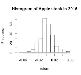
I am going to look into the volatility of Apple stock in 2015. Luckily, you don't need to get stock information from the internet. There is a great library, which allows you to have the information of stocks with simple commands.

Just like LIBOR case, you need to install a package for this, if you don't have.
install.packages("tseries")

[Source code]
library(tseries)
#Getting data from server

data <- get.hist.quote("AAPL", #Tick mark
                       start="2015-01-01", #Start date YYYY-MM-DD
                       end="2015-12-31" #End date YYYY-MM-DD
                       )

#We only take into account "Closing price", the price when the market closes
yesterdayprice <- data$Close
#This is a unique feature of R better than Excel
#I need to calculate everyday return
#The stock return is defined as (today price - yesterday price)/today price
todayprice <- lag(yesterday price) #Lag = Pushback one day in time series
rets <- (todayprice - yesterdayprice)/todayprice
#Annualized and percentage, sd=standard deviation of that collection
vol <- sd(rets) * sqrt(length(todayprice)) * 100

#Draw the histogram on the return
hist(rets, xlab="Return", ylab="Frequency", main="Histogram of Apple stock in 2015")

#String concatenation
output <- paste("Volitility: ", vol, sep="")
output <- paste(output, "%", sep="")
print(output)

[Output]
> source('~/Documents/FinanceInR/stockvolatility.R')
  % Total    % Received % Xferd  Average Speed   Time    Time     Time  Current
                                 Dload  Upload   Total   Spent    Left  Speed
  0     0    0     0    0     0      0      0 --:--:-- --:--:-- --:--:--     0100  1893    0  1893    0     0  14903      0 --:--:-- --:--:-- --:--:-- 14905100 18323    0 18323    0     0   107k      0 --:--:-- --:--:-- --:--:--  107k
time series starts 2015-01-02
[1] "Volitility: 26.7574299862969%"


Saturday, March 19, 2016

How to calculate annuity value in R (Mortgage) & plot

[Question]

I want to buy a new house, but I don't have enough money. I decide to take out the loan from the bank. The house that I want to buy is worth $150,000. Currently, the bank offers the loan with 12% APR monthly compounded. I want to pay the mortgage for 30 years. What would be the monthly payment?

Plus, show the monthly interest payment and principal payment as time goes by.

[Answer]
We are going to solve this problem with annuity formula. And then, we are going to make a table for each payment period. Be sure that APR should be divided by 12 as it is a monthly payment.


Picture is from http://www.financeformulas.net/ 

[Code]

#Mortgage & Annuity
#Let's suppose that you want to buy a house that is worth $150,000
#Current APR rate is 12%, monthly compounded. (monthly rate = 1%)
#You want to take out the loan for 30 years (360 months)
#What would be the monthly payment?
#What would be the table that describes monthly interest payment & principal payment?

principal <- 150000
period <- 12 * 30 #30 years * 12 months
#Getting monthly rate
rate <- (0.12 / 12)
#Getting monthly payment with annuity formula
payment <- principal / ((1-(1+rate)^(-period))/rate)

#In this situation payment would be 1542.92
payment

#Let's build a table
#I use the sequance (1:360), meaning that please make a collection that has the value from 1 to 360.
mortgage <- data.frame(period=(1:360), balance=150000, payment=payment, interest_pmt=(1:360), principal=(1:360))

for(i in 1:360) {
  if(i==1) {
    #First payment
    mortgage$interest_pmt[i] <- principal * rate #Interest payment
    #Payment - Interest payment = principal amount that we can pay back this month
    mortgage$principal[i] <- mortgage$payment[i] - mortgage$interest_pmt[i]
    mortgage$balance[i] <- mortgage$balance[i] - mortgage$principal[i]
  } else {
    #After second payment
    mortgage$interest_pmt[i] <- mortgage$balance[(i-1)] * rate
    mortgage$principal[i] <- mortgage$payment[i] - mortgage$interest_pmt[i]
    mortgage$balance[i] <- mortgage$balance[i-1] - mortgage$principal[i]  
  }
}

#In R, there is a predefined palette. "rainbow" is the most usual one. You don't need to think about which color should be used.
myColor <- rainbow(2)
plot(mortgage$period, mortgage$interest_pmt, xlab = "Period", ylab="Cash Flow", col=myColor[1], type="l")
#Using command "lines" is the easiest way to add one more line on the existing graph.
lines(mortgage$period, mortgage$principal, col=myColor[2], type="l")
#We are going to add legend
legend(1,1200,
       #X, #Y position of the legend. The higher Y value, the higher position in the monitor.
       c("Interest Payment", "Principal payment"),
       lty=c(1,1), #As this is a line graph, we are going to use line as a symbol
       lwd=c(1,1), #Thickness of the line
       col=myColor, #color
       cex=0.6 #If it is 1.0 it's too big. Basically it is a scale factor
       )

[Result]
Monthly payment: $1542.919

#head() command allows you to have a peek at data frame if it is really large.
> head(mortgage)
  period  balance  payment interest_pmt principal
1      1 149957.1 1542.919     1500.000  42.91890
2      2 149913.7 1542.919     1499.571  43.34808
3      3 149870.0 1542.919     1499.137  43.78157
4      4 149825.7 1542.919     1498.700  44.21938
5      5 149781.1 1542.919     1498.257  44.66157
6      6 149736.0 1542.919     1497.811  45.10819

Graph

Friday, March 18, 2016

Real time currency(foreign exchange) table


You can have access to this table via below link.

You can see the corresponding currency value to $1 real time. I use Yahoo Finance API.

Open Real time Foreign exchange table.

I am going to disclose the source code. I am working on comments in my source code which allow you to understand the codes better.


Tuesday, March 15, 2016

Getting and plotting LIBOR in R

LIBOR

London InterBank Offered Rate is considered as an important metric in the interest rate for a long time. Some financial analysts use it as a risk-free rate as the banks lend the money to one another at this rate. (Hot money) Some financial organization uses this rate as a basis to enter into the swap deal with its counter party. (i.e., LIBOR + 2%) It also indicates how much money is flowing today. Along with T-bill, it's the most important metric in finance society.

I'll get the rate from bankrate.com

Please, understand that I used external library. Make sure that you install "XML" package with the instruction
install.packages("XML")
first. if you don't install XML package, which allows you to extract the tables from web site, please install it first.

Here's the source code.

---
#You need to install "XML" package first.
#If you don't have it, please execute install.packages("XML") first.
library("XML")
libor_temp <- readHTMLTable("http://www.bankrate.com/rates/interest-rates/libor.aspx")
#This is a list type. List includes any data type. That's why we use double bracket [[]]
libor_temp <- libor_temp[[1]]
period_temp <- c("1 month", "3 month", "6 month", "1 year")

#As the type of these data is factor(Class), we need to convert this to numeric type
#Direct conversion doesn't work as it interpret each class into just single number
libor_temp <- as.character(libor_temp$`This week`)
libor_temp <- as.numeric(libor_temp)

#The web site contains a lot of informations. All we need is just Libor
libor_temp <- c(libor_temp[3], libor_temp[4], libor_temp[5], libor_temp[7])
libor <- data.frame(period=period_temp, libor=libor_temp)

x <- c(1,3,6,12)
y <- libor$libor

#xlab => Label for X-axis
#ylab => Label for Y-axis
#ylim => The range on Y-axis

plot(x,y,xlab = "Month", ylab="Libor Rate (%)", ylim=c(0,max(libor$libor)))
lines(x,y)

---


Saturday, March 12, 2016

Stop overreacting to AlphaGo's Victory


AlphaGo, the artificial intelligent Go machine made by Google,
beats Lee Se-dol again, putting Koreans in fear and anger toward
artificial intelligent while U.S.people are talking about what happened
in Chicago during Trump's rally. Still, I couldn't find the single article
regarding AlphaGo in CNN, meaning that many people are not aware of Go game,
and it's less significant than Koreans are thinking.
Again, there's nothing new in the algorithm of which AlphaGo have made used.
All algorithms were used in Deep Blue, IBM machine which beat Chess champions
several times. What I was impressed during the Go games was Google utilized more 
than 1,000 virtual machines. Many Koreans have overlooked the importance of this technology, which is a basic ingredient of this huge victory. Just several years ago, the
maximum number of nodes that parallel distributed processing can use was just more
than 50. The coordination loss came from coordinating each machine was significant,
so that it was nearly impossible to use more than 50 machines at once.
In short, the more machine we use, the more loss we should bear in computing power.
It likens to the situation where it is easy to command 5 soldiers
while it is much more challenging to command 100 soldiers in the real battle field.
Google made it. That's a secret recipe,
which allows AlphaGo to calculate 19x19 plates in 90 seconds.
AlphaGo takes only into account "winning probability" of current state, and
what would be the next movement to maximize the winning probability.
It doesn't know Go's rule. That's the only algorithm. No intuition. No magic.
Just statistics and super fast calculation. That's all. Please, stop overreacting to this loss.
It’s an almost expected outcome.

Saturday, March 5, 2016

How to calculate IRR (Internal Rate of Return) in R

[Problem]

Our company has a project that invests $100M upfront. The expected cash flows are like
Y1: $50M, Y2: $50M, Y3: $50M
We don't know the discount rate, but we want to know the BEP(Break Even Point) of the discount rate.

[Source Code]

#IRR (Internal Rate of Return)
#The discount rate that makes NPV value zero.
#You can't use IRR function, if there is a cash outflow in the future.
#IRR can be used only when the all cash outflows take place at time 0.
#Please make sure that cash flow(cf) should take a form of vector
#cf=c(50,50,50)
#<Example>
#f.irr(upfront=-100, cf=c(50,50,50))

f.irr = function(upfront, cf) {
  f.npv = function(x) {
      npv <- upfront
      for(i in 1:length(cf)) {
          npv <- npv + cf[i]/(1+x)^i
      }
      return(npv)
  }
  solution <- uniroot(f.npv, interval=c(0,1))
  return(solution$root)
}

[Example]

f.irr(upfront=-100, cf=c(50,50,50))
[1] 0.2337583
(23.3%)


Friday, March 4, 2016

How to calculate NPV (Net Present Value) in R

[Concept]
When we invest money upfront, and expecting cash flow influx from now on, and the discount rate is given, what will be the present value for all?
For example, there is a construction project which needs $100M right now. I can expect the return $20M in the first year, $30M in the second year, $40M in the third year, and $50 in the forth year.
What will be the present value of all these cash flow? The discount rate is 5%

[Source Code]

#NPV Calculation
#When you define the cash flow, just use below like
#cf <- c(10, 20, 30, 40)
#<Example>
#f.npv(discount=0.05, upfront=-100, cf=c(20,30,40,50))

f.npv = function(discount, upfront, cf) {
  npv <- upfront
  for(i in 1:length(cf)) {
      npv <- npv + cf[i]/(1+discount)^i
  }
  return(npv)
}

[Example]

> f.npv(discount=0.05, upfront=-100, cf=c(20,30,40,50))
[1] 21.94713

How to calculate the bond convexity in R

#Calculate convexity of a bond
#EX) f.convexity(maturity=10, coupon=7, discount=0.07)

f.convexity = function(maturity, par=100, coupon, discount, k=1)
{
    real_maturity <- maturity * k
    real_coupon <- coupon / k
    real_discount <- discount / k
 
    period <- 1:real_maturity
    cash_flow = NULL
    tt = NULL
    pv_cash_flow = NULL
 
    for(i in 1:real_maturity) {
      cash_flow[i] <- real_coupon
    }
    cash_flow[real_maturity] <- cash_flow[real_maturity] + par

    for(i in 1:real_maturity) {
      pv_cash_flow[i] <- cash_flow[i] / (1+real_discount)^i
    }
 
    for(i in 1:real_maturity) {
        tt[i] <- (period[i] * (period[i] + 1))/k
    }
 
    convexivity <- tt * pv_cash_flow
    convex <- sum(convexivity) / (par * (1+real_discount)^2)
    return(convex)
}

How to calculate the bond duration in R (Updated)

[Concept of the bond duration]


As you can see above picture, the bond duration tells you the balance point of total cash flow. If the bond duration is larger, it means that the bond's cash flow is focused on its maturity, implying that it has more exposure to the risk (uncertainty)


It also can be explained by the first derivative of the bond yield-price curve. Long time ago, there was no computing power to calculate the bond price corresponding to the yield rate. (That's no longer case) In order to estimate the bond price corresponding to changing interest rate, investors came up with the concept of "duration"

It's formula is like below.


[Codes]

#This function allows you to get the macaulay duration of the bond
#Maturity = maturity of the bond i.e., 1yr, 2yr
#par = par value of the bond i.e., 100
#coupon = coupon rate i.e. if it is 8% -> 100*0.8=8
#discount = discount rate or YTM i.e., 0.03, 0.04
#k = how often coupon is given in a year. i.e. semiannual=> k=2
#Example: f.duration(maturity=2, par=100, coupon=8, discount=0.08, k=2)

f.duration = function(maturity, par, coupon, discount, k=1)
{
    duration = NULL
    coupon_payment <- k*maturity
    if(coupon == 0) {
      #zero coupon bond
      return(maturity)
    }
 
    for(i in 1:coupon_payment) {
        if(i==coupon_payment) {
          duration[i] <- ((i/k) * ((coupon/k)+par))/(1+(discount/k))^i
        } else {
          duration[i] <- ((i/k) * (coupon/k))/(1+(discount/k))^i
        }
    }

    return(sum(duration)/par)
}


How to calculate YTM (Yield To Maturity) in R (Updated)

[Problem]

There is a bond whose face value is $100. It has 5% coupon rate, paying annually. If the par value of the bond is $100, what is Yield To Maturity(YTM) of this bond?

[Explanation]

YTM is nothing but to quote the bond in terms of the rate. As you might know, the discount rate is different from year to year. By using only one discount rate, we can get a broad sense of the discount rate that this bond bears. The higher YTM, the cheaper the bond price is.

When you use Excel, you should use solver. Yeah, it's hassle. But with R, you can solve this problem with "uniroot" command, which allows you to get a root for single variable equation. You can use this command to any type of single variable equation. (or polynomials)

[Codes]

Here is the source code

#[How to calculate YTM in r]
#You don't need any library in here.

f.ytm = function(ytm)
{
  E = NULL

  price <- 100
  maturity <- 10
  coupon <- 5
  par <- 100

  for (i in 1 : mature)
  {
      E[i] <- coupon/(1+ytm)^i
  }
  E[maturity] <- E[maturity] + par/(1+ytm)^maturity
  sum_e <- sum(E)
  return(sum_e - price)
}

solution <- uniroot(f.ytm, interval=c(0,1))
ytm <- solution$root
print(ytm)